UX/UI, Visual Design, Application Research, Prototyping & Front End Development for Olympus Medical, colonoscopy awareness campaign: Website, Marketing Portal & Collateral.
the problem
Only around 60% of the target population gets tested for colon cancer.
This multi-media campaign, sponsored by Olympus Medical, targets the unscreened population in order to dispel myths about screening and educate about the benefits of early detection and prevention through colonoscopy.
As a market leader in colonoscopy equipment, Olympus has a vested interest in seeing more colonoscopies happen. With the introduction of Cologuard, they need to compete as never before. A simple message that colonoscopy is still the gold standard for colon cancer detection will ensure that Olympus maintains its position as a leader in the field, as well as garnishing appreciation and reputation for education in the public – not to mention potentially saving lives with early cancer detection.
There are 3 major components of this campaign:
Direct to Patient Website
B2C website addresses the population who should have colonoscopies and their families to educate, dispel myths, and encourage screening.
Marketing Portal
B2B marketing portal provides Gastrointestinal doctors with additional marketing materials to aid in education and awareness, helping doctors have the screening conversation with their patients and potential patients.
Digital and Print Ad Collateral
B2C materials that can be branded with local doctors information, while benefitting from the research and messaging of Olympus’s campaign.
Audience
B2C Components (Website & Advertisements):
Anyone between 50-75 years old, anyone with additional risk factors, as well as family members who could encourage target patients to get screened.
Personas: Boomer Bob & Daughter Daisy
B2B Component (Marketing Portal):
Gastrointestinal doctors, their practice administrators and nurses.
Personas: Admin Amy & Doctor Daniel
Role & Responsibilities
DESIGN TEAM LEAD:
- Directed team of 6 designers & front end developers who produced website, marketing materials, and marketing portal
- Planned deliverables, timelines and sprints to align with client’s budget
- Wrote and presented proposal to win business
- Worked with research team who provided validated, targeted messaging
- Ran daily SCRUMs and utilized agile methodologies
- Led weekly stakeholder meetings to show progress and incorporate feedback
- Worked with a remote team, utilizing slack, gotomeeting, basecamp and google docs to stay aligned.
Scope & Constraints
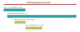
Olympus wanted to get its messaging out as soon as possible, so we planned a multi-phase project, overlapping work on pieces as much as possible and being mindful of deliverables that could cause a bottleneck for approval in subsequent phases.
the process
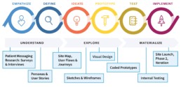
We fit our overlapping deliverables into the Design Thinking Model as best we could, making sure we fully understood our audience and its goals before moving forward into any ideation phases. (diagram borrowed from Neilson Norman Group)
Direct to Patient Materials:
Research surveys and interviews identified a motivating message as the most effective in prompting potential patients to get a colonoscopy
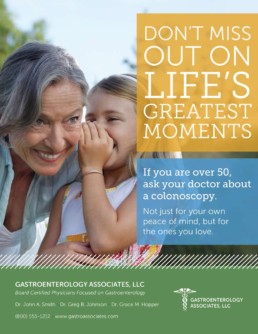
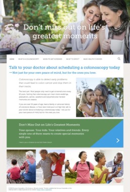
Multiple surveys and interviews from the research team revealed that our target patients are most likely to consider colonoscopy and other medical screening tools when prompted with the motivating statement: “Don’t miss out on life’s greatest moments.”
Our secondary message was to “do it not only for your own peace of mind, but for the ones you love.” The research team tried a variety of messages from humor to control, education, statement of facts etc. but the strongest message by a good margin was aimed at doing it for your loved ones so you can be there for them in the future.
We used these insights and validated messaging to create personas to better acquaint ourselves with our target patient, as well as identify an important secondary user – the patient’s adult children and spouses.
Our Personas and user stories for Boomer Bob and Daughter Daisy helped clarify motivations and goals around screening.

Boomer Bob
“I want to find out what screening entails so I can get over fears about the procedure.”

Daughter Daisy
“I want to find out how screening saves lives so I can convince my dad to get screened.”
Marketing Portal for Gastro Docs:
We built on previously gained knowledge and expertise from personas “Doctor Daniel” and “Admin Amy.”
Our team had a good deal of accumulated knowledge about doctors and practice admins from our work in the medical space. We previously built an ad portal for Stryker Orthopedics, which had some broadly similar features. We were able to build on this knowledge by outlining personas for Doctor Daniel and Admin Amy as the most likely users for our marketing portal application.
“I’m busy and marketing isn’t my job so don’t make me think!”

Doctor Daniel
“I want an easy way to get the right patients so I can focus on patient care.”

Admin Amy
“I want to quickly and effectively advertise the practice so that we can fill appointments.”
Direct to Patient Website:
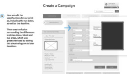
Patient confusion surrounding the difference between a colonoscopy and other testing methods, as well as concern about “prep” and what the procedure actually entails made these topics a priority for phase 1.
User stories identified what areas the direct to patient website should address first and foremost, along with additional information and concerns that could be added in later phases.
Determine phase 1 pages for website:
- Home
- What is colonoscopy? (vs. other screening tools)
- When to get screened – risk factors
- What to expect – prep myths
- Make healthy choices – decrease risk factors
Potential phase 2 pages:
- Risk assessment quiz
- FAQs
- Testimonials
- Physician locator
- Spanish language translation
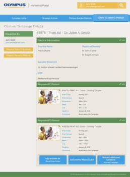
Marketing Portal for Gastro Docs:
We were able to build upon past knowledge in designing a similar ad tracking system for Stryker Orthopedics. We used this knowledge, along with some additional insights from our customer-facing project managers to identify key areas for confusion and customization.
KEY CONCERNS AND FEATURES:
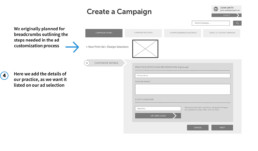
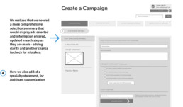
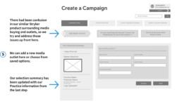
- Identify features most useful to users: ex) project managers saw that users preferred to duplicate past campaigns, then edit new details, instead of starting from scratch each time
- Create a unified interface to accommodate any type of ad, what are common steps, where do processes diverge?
- Map journeys for each known ad type: print, web, poster, postcard, brochure
- Identify key information for customization: Doc logo, name, location etc.
- Unique contraints, limitations, information needed for each type of ad: ex) print: dimensions, bleed; ex) postcard: quantity, mailing list, printing
- Allow for expansion if ad types are added in the future
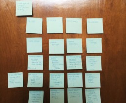
I found post-its to be especially helpful in arranging tasks into user flows, being able to easily and quickly move actions around to consider alternate approaches.
Marketing Portal for Gastro Docs:
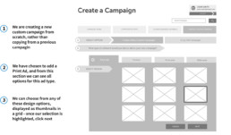
We wireframed the user journeys for each known ad type, as well as campaign listing, reviewing, editing and account settings.
The wireframes for the website were fairly straightforward, but the journeys for the marketing portal were much more complex and benefitted from wireframing most of its functionality to avoid surprises in programming functionality required.
Create a Print Ad Campaign User Journey
User Interface & Visual Design
Style Tile & Voice Guide
We needed to stay in keeping with Olympus’s brand guidelines, but also establish a unique look and feel. We identified the tone and voice as well as key imagery that would embody these key words.
Tone Keywords:
- Colorful
- Friendly
- Soothing
- Conversational
- Trustworthy
Key Imagery
- Active adults enjoying life
- Interacting with younger family members
- Key moments in life, as well as quieter ones
Direct to Patient Website
This is where we layer our visual design elements and look and feel on top of our wireframes in order to create a functional, coded prototype.
We used an agile programming approach, to get everything into code as quickly as possible and to iterate there as we build through sprints. I led weekly deliverable meetings with clients to ensure “no surprises” and continuous, small adjustments based on feedback along the way.
This made for a well informed stakeholder team who were invested in our decision making process and were 100% on board with our solutions.
Marketing Portal for Gastro Docs:
Due to our detailed wireframes outlining each major user task, we were able to move rapidly on development for the Marketing Portal.
We borrowed styles from the direct to patient website and tweaked them to have a distinct experience that was related, but not identical. Luckily our friendly, colorful tone and look and feel could crossover and still feel appropriate since the marketing materials all matched this look as well.
We did add some tool tips and helpers along the way where our testers were getting lost and needed more information.
Thoroughly tested both website and marketing portal across multiple devices and browsers.
We used our own internal team who hadn’t been working on the project to help test with fresh eyes and identify any glitches or hang ups.
I also like to wrap up any project launch with a post mortem to discuss items that went well, could have gone better and what we can learn from this project moving forward.
Review analytics and notes from post mortem, then prepare for phase 2!
Lessons & Outcomes
Staying focused on our central mission of getting people screened and as a result, saving lives kept the team aligned and motivated.
Trying to overlap this many pieces and deliverables concurrently certainly had its challenges, but for the most part we were able to avoid major code edits or direction changes through well planned sprints and weekly deliverable meetings with our stakeholder team.
Having clear, validated messaging from the start gave us a firm grasp on our mission, users, tone, look and feel, and everything that followed. This project could not have been successful without that key research coming first.