Product Research, UX Design, Prototyping and User Testing for Budding Gardener, an iOS app to help new gardeners keep plants thriving.
the problem
Keep plants alive!
In our hectic, modern life, we need to stop and smell the roses – The Budding Gardener App will help new gardeners learn and remember key tasks to keep new green friends happy and healthy.
An Effective Solution must address 2 main pain points for new gardeners:
1: Need for Curated, Personalized Information
The internet is vast and new gardeners must sift through a plethora of sites and blogs – mostly aimed at experienced gardeners – to try and glean the few tidbits of information that are actually relevant to their own situations.
2: Timely Reminders to Perform Tasks
The second challenge is to actually remember to implement these newly gained insights. When life gets hectic, those silent green pots in the corner tend to get overlooked. Reminders help create new habits and help complete key tasks when they are most needed.
Audience
Mostly new gardeners, those looking to deepen a casual hobby, and those with trouble keeping plants alive.
Three personas were created as targets for this project:
- Millenial Madison – “gardening is #adulting”
- Healthy Heather – “gardening is productive me-time”
- Hobby Holly – “gardening is a fun activity”
Scope & Constraints
As a new gardener I saw a need for this product, but wanted to validate my assumptions and create a product that could work for more new gardeners than just myself.
Done as a passion project, removing time and money constraints that always exist when working for clients, in order to fully investigate this product idea.
Research included feedback from:
42
Surveys
4
Interviews
22
Card Sorts
5
Usability Tests
the process
Product Research
- Competitive Analysis
- Screener Surveys & Interviews
- Empathy Maps & Personas
- User Stories & MVP
UX Design
- Card Sort & Site Map
- User Flows & Journey Maps
- Sketches & Wireframes
Visual Design & Prototyping
- Style Tile
- High Fidelity Prototype
User Testing & Iteration
- User Tests (in person & remote)
- Prototype adjustments
Does the product already exist?
There are thousands of apps out there, was there already a perfect product for helping new gardeners keep plants alive?
There is also much that can be learned from other, related products – What was successful or unsuccessful? How could pitfalls be avoided and useful features built upon?
KEY TAKEAWAYS:
- Importance of a fun, conversational interface – an app focusing on a hobby should be light in tone and delightful to use.
- Need for clear, concise, digestible information – sifting through facts gets tedious, distilling to the most important facts and allowing for elaboration will keep the interface clean and clear.
- The perfect product does not exist – we can proceed with our product knowing we aren’t re-inventing the wheel.
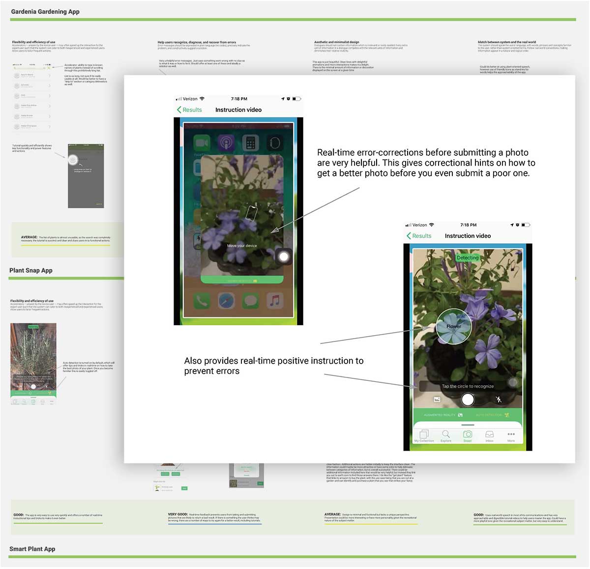
Competitive Analysis reveals successful user guides in the Plant Snap App. It teaches users – in real time – how to take the best pictures of their plants for detection and identification.
What are the main pain points?
To learn more about the problem, I created a research plan and screener survey to identify and recruit interview participants across demographics with an interest in gardening.
The aim here is to learn as much as possible about this problem and the people who encounter it. I always have a script with open ended questions to start from, but try to get into a more conversational rhythm with lots of “why” and follow up.
KEY SURVEY INSIGHTS:
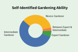
- Most respondents who were already gardeners self-identified as “novice” or “intermediate,” further reenforcing the existence of a ready market for those looking to deepen their knowledge.
- Top methods of finding gardening information include internet searches, talking with friends and family, and good old fashioned trial and error.
- All gardeners expressed a relatively high interest in an app of this type, wanting information on all suggested plant tasks and reminders.
I conducted 4 interviews (phone and skype) with gardeners of varying ages, levels of knowledge and time available to devote to gardening.
I chose people that might fit each of my provisional personas.
KEY INTERVIEW INSIGHTS:
- Participants ultimately validated my initial assumptions on key pain points, as well as identified additional points to explore – “diagnose my plant” feature.
- Tailoring information to users specific plants and conditions was considered extremely helpful by participants. All expressed frustration in finding the correct information as it related to their specific plant in their specific location.
- Timeliness as key issue in gardening – if you miss a key timed event, it can have dire consequences for plants. The idea of reminders was welcomed.
- Having information available at their fingertips – i.e. phones – while out in the garden would be helpful. Some related stories of assembled binders or large books that are not easy to have on the spot.
“It’s when you are out in the garden that you realize you need information, but you don’t want to traipse inside in your dirty clothes to look things up”
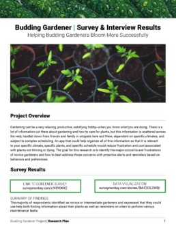
Survey & Interview Results PDF
Who is the product for?
After my interviews, I was able to round out my 3 personas using empathy maps to better understand how or if they would use a gardening app.
Healthy Heather’s time constraints and Hobby Holly’s technology anxiety might discourage both from being early adopters.
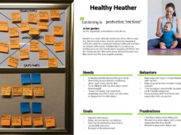
Healthy Heather Empathy Map & Persona
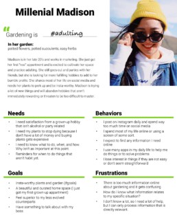
I decided to focus on the Millenial Madison persona as the most likely to use an app technology to solve gardening problems.
It’s still helpful to be mindful of Healthy Heather and Hobby Holly, but prioritizing users and features is important in determining an MVP for an initial product launch.
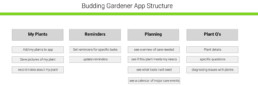
How should the app be organized?
Using Optimal Sort, I conducted an open-ended card sort with participants remotely, which revealed the need for a new “planning” category.
I went back to some of my survey participants to recruit for the card sort. This helped identify key terms or phrases that people might inherently use to describe categories, thus reducing the mental load required to “learn” an app.
Most participant responses lined up with terms and categories I had expected. This made organizing high-level functionality of the app very clear.
What user interactions are necessary?
I mapped 4 key user journeys defined in my MVP, iterating to simplify the process as much as possible, mindful that every action required is a barrier to engagement, especially with a busy, distracted user like our Millenial Madison persona.
Actions should be clear and get our user the information they need as quickly as possible, while in a logical order, identifying areas of potential confusion or barriers to entry, as well as looking for opportunities to build confidence and add delight.
JOURNEYS MAPPED:
- Add a plant to the app for care
- Update reminders for a plant
- Diagnose an issue with my plant
- Find a plant that would work well in my environment
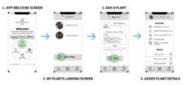
USER FLOW: Add a plant to the app for care
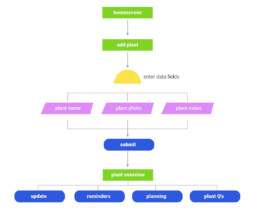
What are the app elements and their hierarchy?
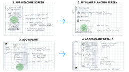
I always start with rough, hand drawn sketches to quickly ideate possible interface scenarios, identifying key text, images, buttons, and inputs necessary.
I like to use my sketches to ask myself questions, without tying myself to a specific interface solution. These early questions keep front of mind issues users might have or places where alternate solutions could be explored – for example a toggle versus a checkbox.
I sketched all of the journeys identified in previous step, beginning to put weight and consideration on not only the inputs, but additional information like persistent navigation and headers.
progression of the “add a plant” journey from sketches to low fidelity wireframes.
How should the app look & feel?
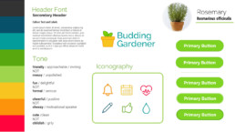
I like the “this not that” framework to help clarify the exact tone that is needed, and then identify key typographic elements and colors that will help convey this spirit.
We can take all the information we have gleaned from our research thus far to establish a tone and look and feel that will appeal to our “Millennial Madison” persona without alienating our Healthy Heathers and Hobby Hollys.
Visual & Tone Style Guide
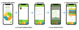
“Add a plant” journey revisited in high-fidelity mockup.
KEY INSIGHT: Added Step 4: I realized I needed a “success” message, as well as tips on what to do next as a prompt for people to continue using the app.
Lessons & Outcomes
Project work with a team inherently involves compromise – on scope, time or budget. Removing those constraints for this project let me fully explore and exhaust all research methods I felt might be helpful. It was a freeing experience that allowed for reflection and insight.
The deep research helped me identify where some insights overlapped and under more realistic time and budget constraints, where I could have cut additional steps without losing the most important findings.
This will give me more confidence in the future when constructing my research plans for real-life constraints, knowing that I can get enough information from a constrained discovery to make informed, validated decisions.